Say the useful thing first.
Lead with the customer’s problem, the outcome you create, and the service that solves it. Clever copy can follow; clarity cannot wait.
A good-looking website earns attention. A useful one makes the next step obvious—so more of the right visitors become enquiries, bookings, and customers.
Before a visitor reads every word, they decide whether they understand you, trust you, and know what to do next. Our web design process gives each of those decisions a deliberate place on the page.
Lead with the customer’s problem, the outcome you create, and the service that solves it. Clever copy can follow; clarity cannot wait.
Show real work, real specifics, and evidence close to the moment someone is deciding whether to contact you.
Every page needs one obvious next move: enquire, book, call, buy, or learn more. A strong path makes action feel natural.
Every project begins with the same question: what needs to become easier for the person arriving here? The answer shapes the hierarchy, the content, and the conversion path.
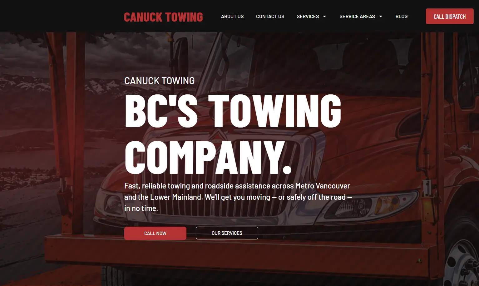
Urgent service information shaped around the decision to call.
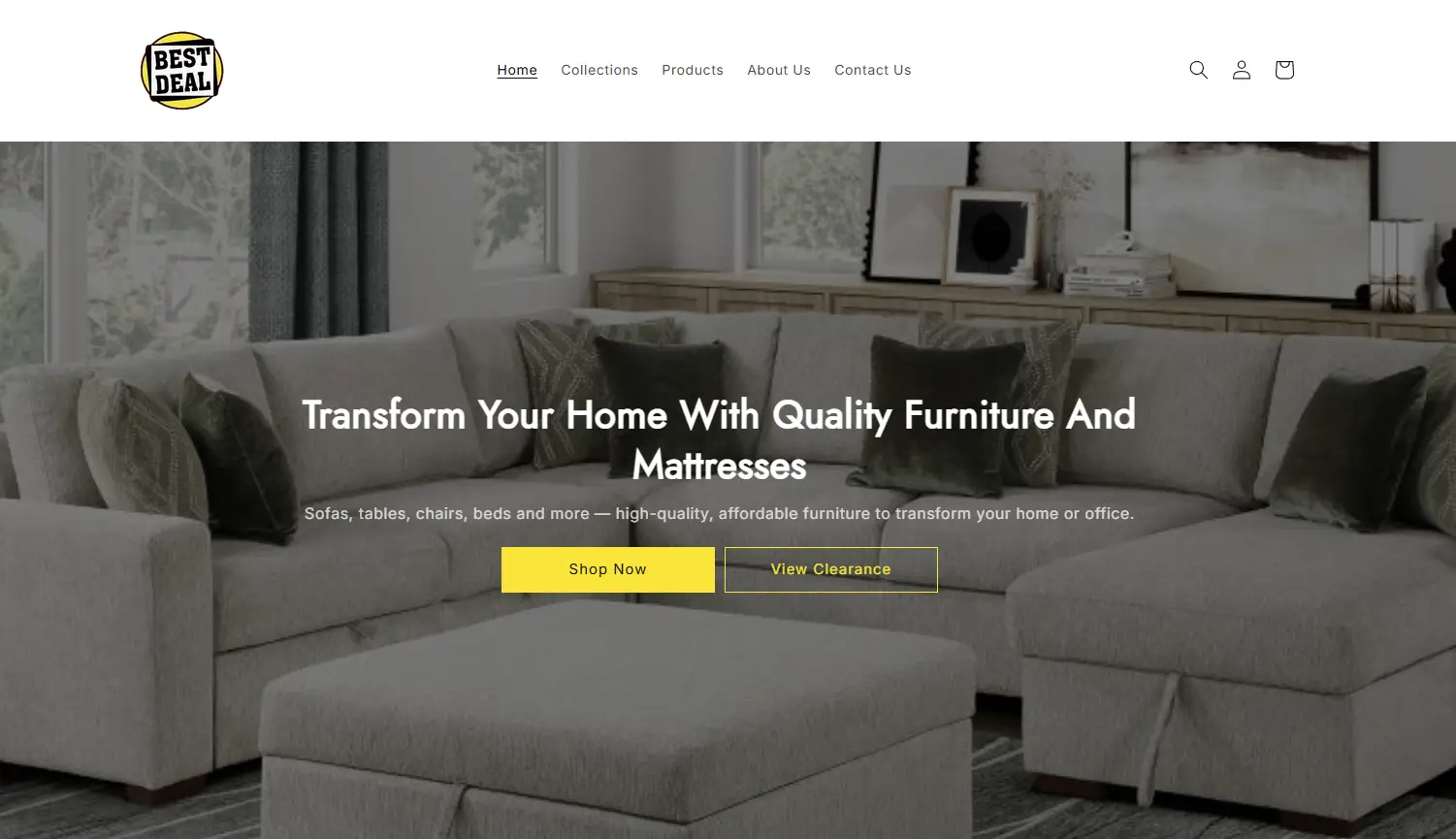
Product-led browsing with a clearer route to purchase.
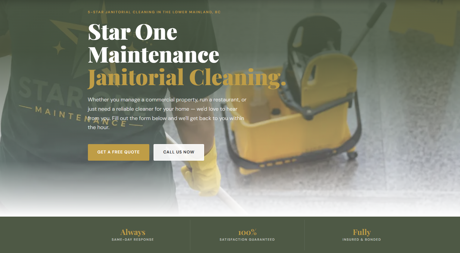
A confident first impression for a practical service business.
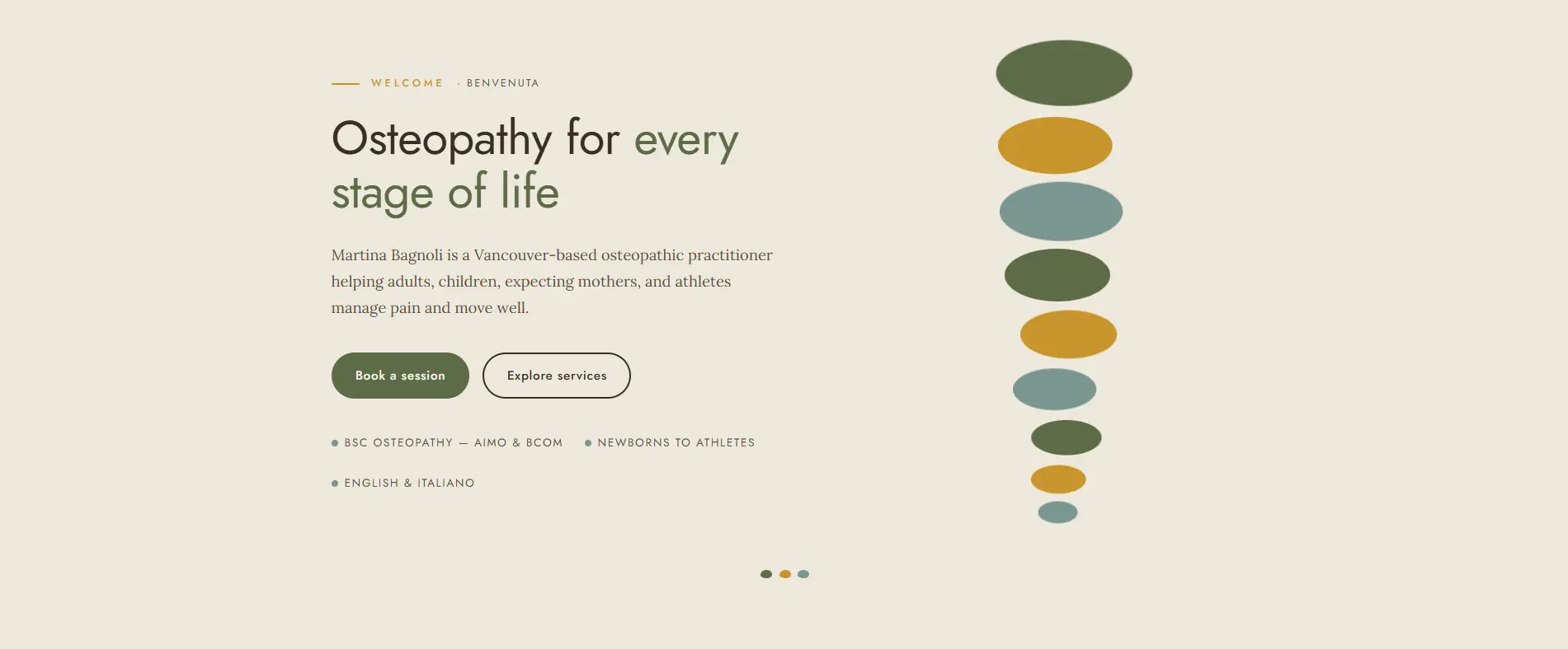
Calm visual language designed to make a sensitive decision easier.
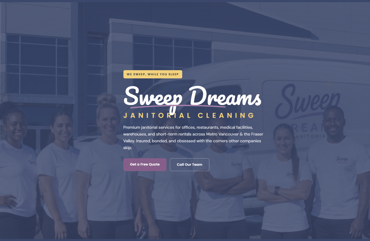
A polished service experience built for confidence and quotes.
A high-performing website is not a collection of attractive sections. It is a sequence of small, confident decisions. We plan the order so a visitor understands the offer, sees why it matters, finds proof, and reaches an obvious next step without having to hunt for it.
Make the offer and audience clear within the first screen.
Explain the problem you solve in language customers use.
Place real projects, results, and reassurance near the decision.
Give the visitor one simple, visible route to take action.
Use this test before you redesign anything. If the answer is unclear, the next improvement is rarely a new colour or a new animation. It is usually a better message, stronger proof, or a simpler route to action.
Your first heading should explain the service or outcome without needing industry knowledge.
Give visitors proof they can recognise: work, results, experience, reviews, or a clear process.
Make one primary action visible before a person has to search for it.
These are natural places to connect future guides, audits, and articles without adding another hard-sell section to the page.
A practical checklist for your first screen, proof, page flow, and primary action.
Read the guide Guide 02How to tell the difference between a cosmetic update and a conversion problem.
Read the guide Guide 03The small structural changes that make a website easier to understand and act on.
Read the guide